PDF編輯

繪圖
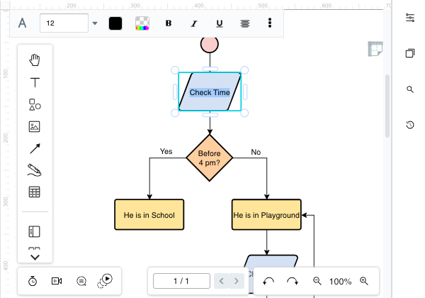
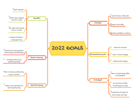
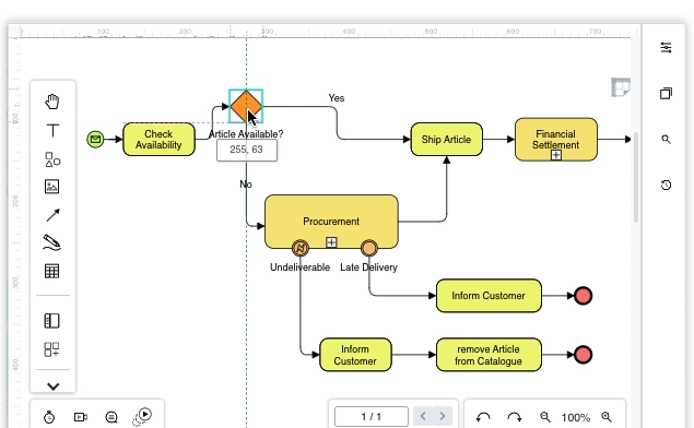
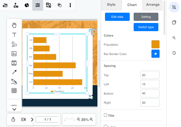
創建圖表
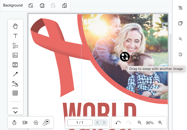
平面設計
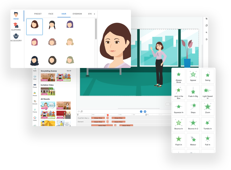
動畫翻書
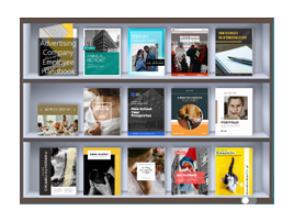
書架組織
文檔編輯
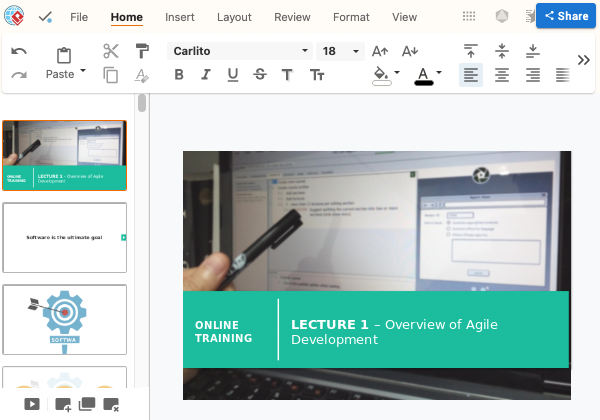
簡報製作工具
無論您的 PDF 文檔有多大,只需一秒鐘即可上傳並開始編輯。
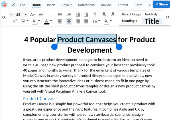
內聯編輯和格式化文本內容。 通過我們先進的 PDF OCR 工具將掃描頁面中的文本轉換為可編輯文本。
將 PDF 與一組豐富的文件格式相互轉換。 使用高級 PDF 工具合併、拆分和保護 PDF 文檔。

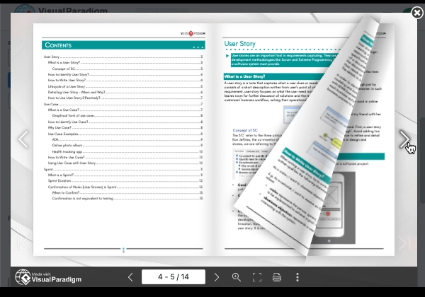
通過將您的文檔、演示文稿和 PDF 作為動畫書共享,為您的觀眾提供更好的閱讀體驗。
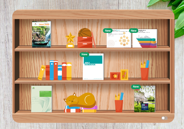
用漂亮的書架為您的出版物編目。 您可以使用自定義主題和样式來個性化書架。
將任何現有文檔、電子書(例如 EPUB、AZW4 等)、演示文稿轉換為動畫翻頁書并快速共享。
我們總是發布 Visual Paradigm Online 的新更新。 以下是我們精選的最新功能。
企業
使用一體式辦公套件節省資金,使部門和團隊能夠在一處創建和共享文檔、PDF 和圖表。
商業
為您的業務的每個階段創建和保存文檔和演示文稿,使用圖表和圖形來增強效果。
教育
直觀的圖表製作工具,支持流程圖、思維導圖和 200 多種圖表類型,可滿足所有學生的需求。
個人
在日常生活場景中創建文檔、演示文稿和圖表,全程支持您的自學之旅。