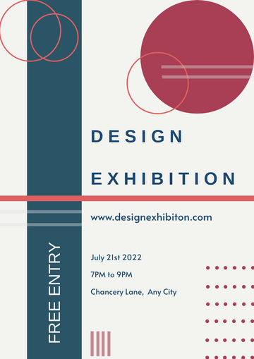
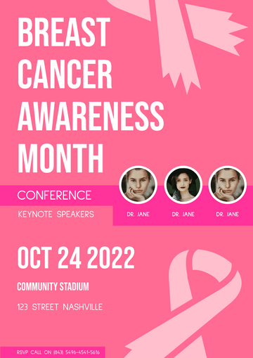
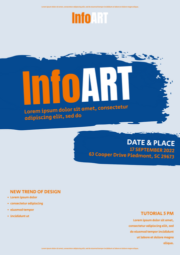
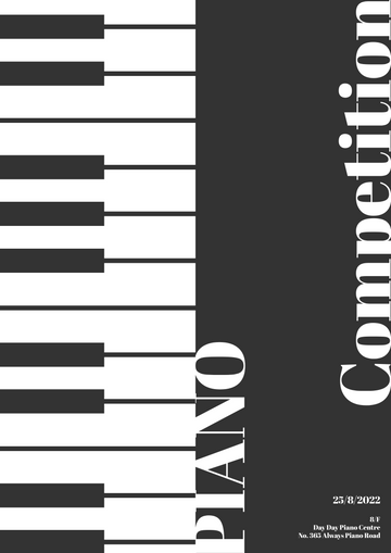
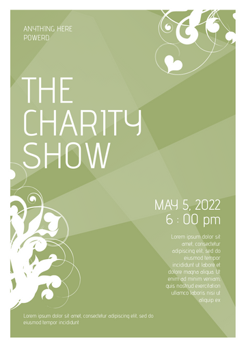
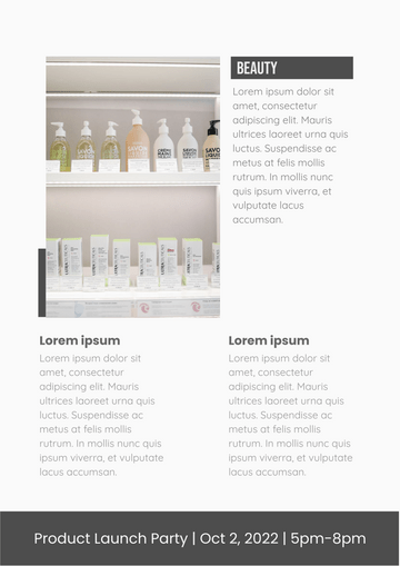
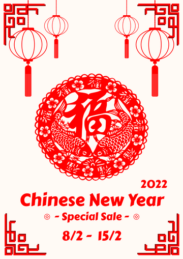
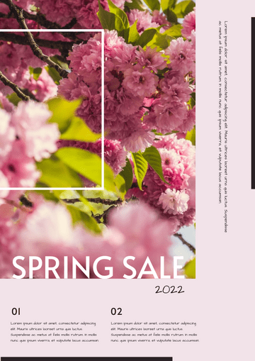
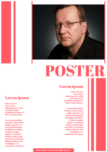
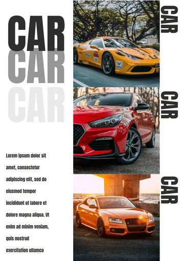
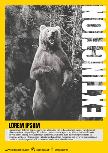
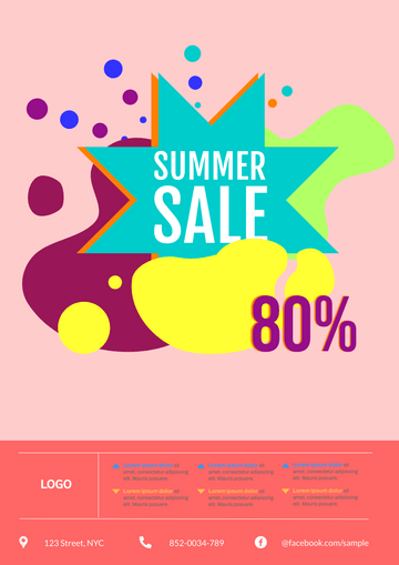
Design Exhibition Poster
Tips for Designing a Poster
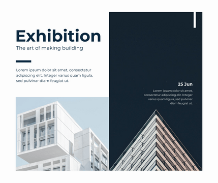
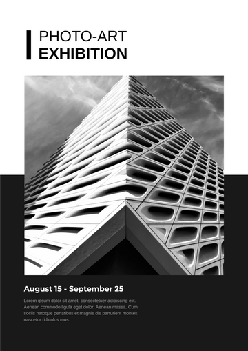
Graphic design is one of the most fundamental skills for a designer. And the design of posters and leaflets is almost a required course for every designer. Today's banners, promotional and promotional digital posters on the web are largely derived from what we know as poster design. Posters have always been one of the most interesting and practical forms of presentation for promoting products and connecting customers. Many excellent posters not only present information, but also do some interesting things by the way.
What problems should be paid attention to if you want to design a good poster?
Make the poster readable from a distance - we often emphasize readability when designing. Posters are the medium to do this, at least to ensure that the basic content of the poster can be clearly read from a distance.
Increase Contrast - Your poster needs to be so clear that a glance at it will grab the user's attention. A high contrast between the elements will help you do this. Forget subtle tints and drab color schemes. Bold colors and exaggerated glyphs are more appropriate for the poster.
Design the poster based on size and location - will the poster be on the subway station or on the wall of the building? Where and from what Angle will the user view it? What is the aspect ratio of the poster itself? What's around it, and does it affect the visual presentation of the poster? These factors all have to do with your poster design.
Emphasize the primary vision - Whether your poster is a picture, illustration, or text, the primary vision is at the heart of your poster. Like a title, it needs to be clearly identifiable from a distance
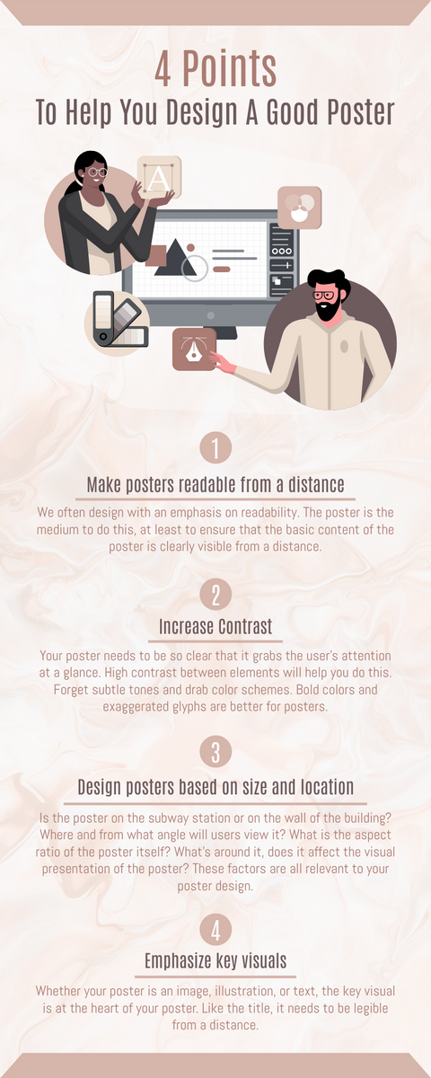
(Infographic about how to design a good poster. Edit now.)

