The histogram is one of the most frequently used tools in Six Sigma. A histogram is a visual charting tool used to represent the frequency distribution of data falling into different groups of a population or sample. It looks similar to a column chart, as it has vertical bars with different heights to signify the frequency of that group.
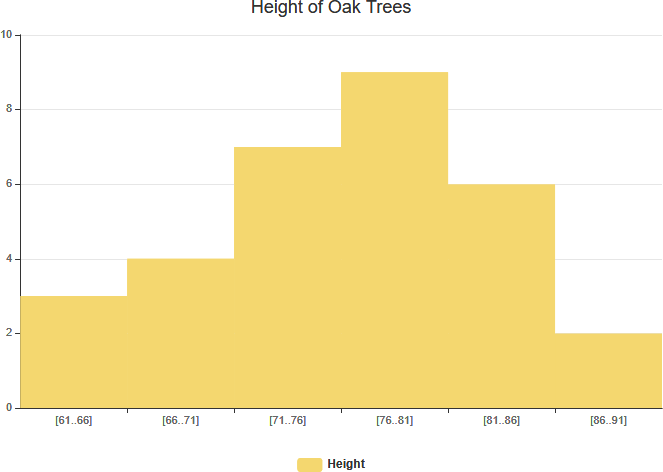
As the Figure shown above, a histogram is a graphical representation of numerical data. It is constructed by placing the class intervals (or sometimes a continuous category) on the horizontal axis of a graph and the frequencies on the vertical axis. A continuous category, such as age, may have a large number of possible values and this could result in a complex histogram with so many columns that it becomes difficult to interpret the information. For this reason, the data in a histogram are often grouped to reduce the number of categories to form the frequency distribution.
A histogram is the most commonly used graph to show frequency distributions.
What is Frequency Distribution?
A frequency distribution shows how often each different value in a set of data occurs. Frequency distributions are mostly used for summarizing categorical variables. As mentioned before, the metric variables tend to have many distinct values. These result in huge tables and charts that don’t give insight into your data. In this case, histograms are the way to go as they visualize frequencies for intervals of values rather than each distinct value.
Histogram vs Column Chart
You may see a histogram and think that it looks like a column chart, but there is one important difference. Column Graph and Histogram are the two ways to display data in the form of a bar diagram. As they both use bars to display data, people find it difficult to differentiate the two.
- Column charts are used to represent and compare categorical variables.
- Histograms are used to represent and compare distributions of quantitative variables.
Column Chart vs Histogram Example
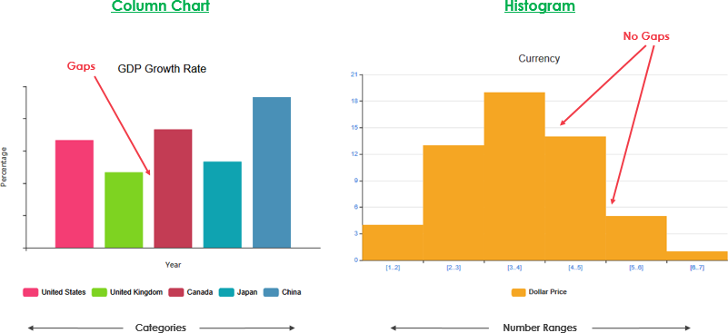
Note That:
We draw a histogram on a single variable, while we draw a column graph on two variables. The major difference is that a histogram is used to plot the frequency of a continuous data set in class intervals also called bins. Column charts are used to plot other types of variables including ordinal and nominal data sets.