The seven management and planning tools were the result of operations research and TQM in Japan after World War II in the 1970s. This toolset can be used to encourage innovation, facilitate communication, and help for planning in a team approach. These tools were developed independently for diverse purposes. However, they were assembled as a set of techniques for achieving efficiencies in the planning and management of operations.
These 7 Management and Planning tools are:
- Affinity diagram Organizes a large number of ideas into their natural relationships.
- Interrelationship diagram: Shows cause-and-effect relationships and helps analyze the natural links between different aspects of a complex situation.
- Tree diagram: Breaks down broad categories into finer and finer levels of detail, helping to move step-by-step thinking from generalities to specifics.
- L Shaped Matrix diagram: Shows the relationship between two, three, or four groups of information and can give information about the relationship, such as its strength, the roles played by various individuals, or measurements.
- Matrix data analysis: A complex mathematical technique for analyzing matrices, often replaced by a similar prioritization matrix. A prioritization matrix is an L-shaped matrix that uses pairwise comparisons of a list of options to a set of criteria to choose the best option(s).
- Arrow diagram: Shows the required order of tasks in a project or process, the best schedule for the entire project, and potential scheduling and resource problems and their solutions.
- Process decision tree: Systematically identifies what might go wrong in a plan under development.
The Most Essential 7 management and planning tools
What is an Affinity Diagram?
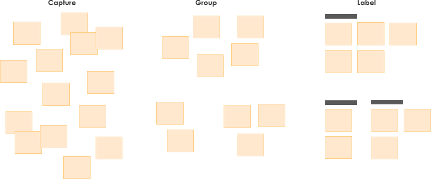
The affinity diagram organizes a large number of ideas into their natural relationships. It is used to generate, organize, and consolidate information related to a product, process, complex issue, or problem. After generating ideas, group them according to their affinity, or similarity. This idea creation method taps a team’s creativity and intuition. It was created in the 1960s by Japanese anthropologist Jiro Kawakita.
3 Steps for Creating an Affinity Diagram
To creating an affinity diagram, it involves: collect/organized and analyzed data into useful information. The affinity diagram is normally led by a facilitator to guide the team through the following steps:
- Capture: Record each idea with a marking pen on a separate sticky note or card
- Group: Look for ideas that seem to be related in some way and place them side by side
- Label: labeling each group of cards into categories and eliminate duplicate ideas.
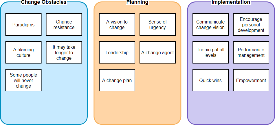
Affinity Diagram Example – Sustainability Change
Conduct a brainstorming session and use the affinity diagram to identify how to successfully implement and sustain change within an organization as shown in the Figure below:
What is an Interrelationship Diagram?
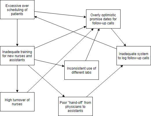
Interrelationship Diagram is an analysis tool that helps you discover the cause and effect among critical issues. Interrelationship diagrams use arrows to show relationships, such as the inputs, outputs, and interconnections among processes (Dias and Saraiva, 2004). Arrows are used to show the direction of influences, and one item may influence many other items or be influenced by many other items.
Interrelationship Diagram Example
A local physicians’ group is experiencing a relatively high number of patient complaints regarding the lack of returned phone calls following a patient visit where some kind of test was ordered. In particular, the patients are frustrated that the promised call notifying them of the test results is either delayed or must be initiated by the patient. The office manager of the group conducts a brainstorming session to generate potential reasons for the lack of effective and timely follow-up calls.
The group then takes the brainstormed list and organizes the potential reasons using an interrelationship diagram (Source: sixsigmadaily.com)
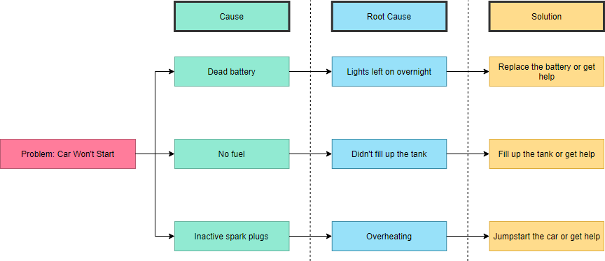
What is a Tree Diagram?
Tree diagrams use a structure with broader categories on top and break them down into details at the lower levels (Liu, 2013). For root cause analysis, the failure under investigation should be listed on top of the tree diagram. The potential causes of the failure are then listed beneath the first failure. A tree diagram can be used to visualize the many potential failures that led to a final failure; however, the failures identified should still be empirically investigated.
In addition to the basic usage of a decision tree, it can be easily modified to suit any situation by structuring it in multiple levels for accommodating additional information, such as potential risks, drawbacks, and solutions.
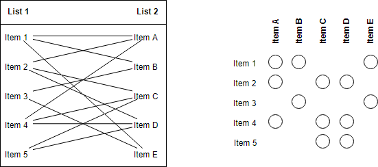
What is Matrix Diagram?
A Matrix Diagram is a tool that illustrates the critical relationships between or among two or more groups. It can be enhanced to show things like the strength of the relationship or the different aspects of the relationship. The matrix can be thought of as a special form of a table where the cells contain a simple symbol or number, which is derived from a defined set of rules.
For example, the example below shows how the relationship between two items can now be indicated in the cell where the row and column of the two items interlinked.
What is Matrix Data Analysis Chart?
The Matrix Data Analysis Chart (or MDAC) helps classify items by identifying two major characteristics common to all items and then plotting each item as a point on a standard x-y chart. This makes it easier to see how the individual items relate both to the characteristics and one another.
For example, a washing powder may have different efficiencies at achieving ‘softness’ and ‘stain removal’ in garments made of acrylic, polyester, wool and various fiber mixtures. If similar effects are found in a group of fibers, then changing the powder ingredients may similarly affect the whole group.
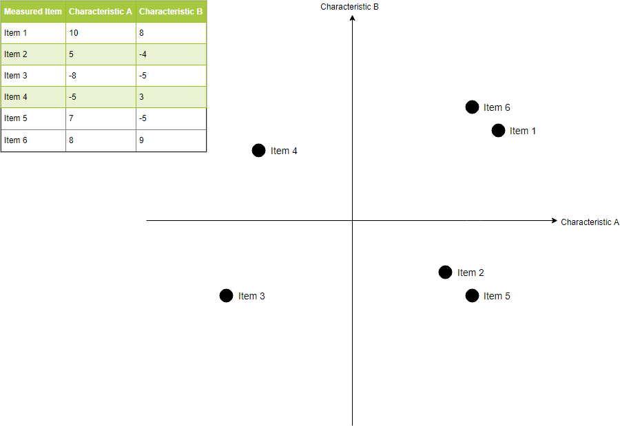
Such a chart shows the clustering and positioning of items relative to one another.
What is an Arrow Diagram?
Arrow diagrams are used to evaluate and review projects and their planning to determine the optimal sequence of events and their interconnectivity. It is often used for scheduling and to determine the critical path through nodes. The basic arrow diagram shows:
- How the individual tasks in a project are related, i.e. their dependencies. This promotes an understanding amongst a team of the importance of their particular task.
- The possibility of potential problems with timings and resources.
- The possibility of potential program improvements through resource additions or program changes.
- The best schedule for the project, i.e. the critical path.
- The effect of task delays on the overall project schedule.
![]()
Note that the dotted line represents a dummy activity to ensure that Event change starts only after both Verify change order and Assure stock are completed.
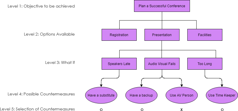
What Process Decision Program Chart?
A Process Decision Program Chart (PDPC) is a tool for identifying and documenting the steps required to complete a process. It is often used in the problem-solving process where it allows for the identification of potential process issues that have led to a process failure.
The process statement is placed at the top level of the chart and the required process steps move from left to right at the next level. Further levels of detail may be required until the final level is reached which indicates countermeasures that might be taken to prevent any delay with the process implementation.
As shown in the Figure below, different shaped boxes are used to highlight risks and identify possible countermeasures (often shown as “clouds or ovals” to indicate their uncertain nature).