6 Ways to make your infographic more attractive
If you want your infographic to get more attention, you can try to read the following methods.
1. Know your audience
A good infographic clearly knows who the target audience is.
Based on the age, gender, and culture of your ideal audience, you already have the right way to set what tones, what colors to use, and what visual effects to include. The key is to create an infographic that suits the needs of the audience.
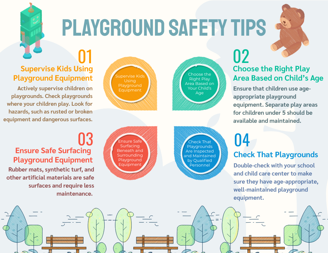
Children Playground Safety Infographic
For example, the infographic below is made specifically for children. It is completely visual, with elaborate color illustrations, and interesting illustrations instantly reveal the main concept: Children Playground Safety Infographic. This is a good way to educate young children.

Ways To Reduce Stress Infographic
Infographics can also target specific groups, such as office workers. In one example, we saw a simple and comprehensive visualization, which resonated with most office workers.
2. Catchy headings
A good infographic starts with a title that correctly sets the theme and core information.
In fact, a powerful title can determine the success of your graphics. When people deal with information, they always start with a big headline. Once attracted by the topic, they will have the curiosity to learn more.
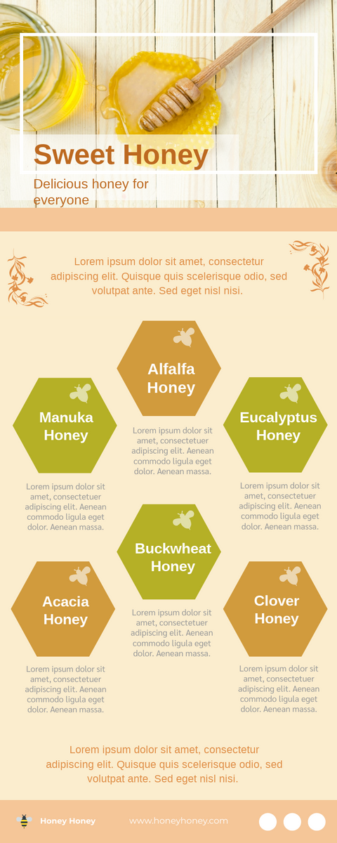
Introduction Of Honey Infographic
This Honey Infographic: Introduction Of Honey Infographic is a good example.
The topic was catchy and explained the topic in an instant: Hone Honey, Honey For Everyone
3. Simple
Sometimes you really need to explain a very complex concept through an infographic.
However, for your audience to work hard to understand your presentation, you must first overcome the whole point of making an infographic. If you keep too many elements and make your design very busy, it will distract the audience from the main points. If you need to include more data, consider making your infographic presentation longer, but make sure to use simpler parts.
Some tips for you:
Use a lot of blanks.
Let your parts and important areas breathe.
A busy infographic can be overwhelming and difficult to read.
4. Graphical
Using graphics can make the infographic more intuitive and clear, using illustration to assistance the data present, can make it more vivid.

This is: 9 Tips to Stay Productive When Work from Home Infographic
Through the use of illustrations to express features, the picture is more vivid and interesting.
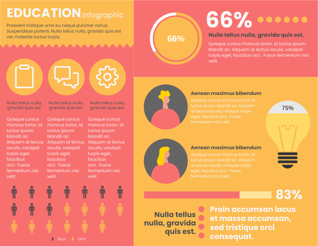
This template also has use graphics to represent values: Education Department Horizontal Infographic
Relevant research data graph: The value originally represented by the bar chart or pie chart is replaced by the number of graphs, which is particularly eye-catching, and the degree of difference between the values can be seen at a glance, and the picture is richer and more vivid.
5. Good storytelling
In a way, the infographic tells a story.
Therefore, a great infographic will tell a great story, clearly and accurately. Since this is your story, you have complete control over its flow and the tools you use. You can use white space, text levels, color contrast, and charts to create processes.
Storytelling is a good technique that can guide the audience to understand information. Infographics are a good storytelling medium; good infographics tell stories that people remember and recall over time. The infographic uses storytelling skills to effectively introduce the audience with a very short summary at the beginning about why the topic is important to them and what the infographic will cover.
6. Information visualization
Visualization is not a new concept. There are many examples of information visualization in life: public instructions, statistical graphs, star ratings, staff... Information graph refers to the visual representation of data, information, or knowledge. Information visualization is the study of (interactive) visual representation of abstract data to enhance human perception. Abstract data includes numerical and non-numerical data, such as text and geographic information. An attractive infographic will never have some boring data showing, you can try to use information visualization skills to create an infographic and convey abstract information in an intuitive way.
Don't know how to create a clear and attractive infographic? Don't worry! You can try to present your information with the VP Online infographic template!