Interrelationship diagrams show cause-and-effect relationships and help analyze the natural links between different aspects of a complex situation. The analysis helps a team distinguish between issues that serve as drivers and those that are outcomes.
When to Use an Interrelationship Diagram?
- Encourages team members to think in multiple directions rather than linearly
- Explores the cause and effect relationships among all the issues, including the most controversial
- Allows key issues to emerge naturally rather than to be forced by a dominant or powerful team member
- Systematically surfaces the basic assumptions and reasons for disagreements among team members
- Allows a team to identify the root cause(s) even when credible data does not exist
Steps for Creating Interrelationship Diagram
- Place the cards in a circle on the wall.
- For each idea, ask, “Does this idea cause or influence any other idea?” Draw arrows from an idea to the ones it causes or influences. Repeat the question for each idea.
- Draw only one-way relationship arrows in the direction of the stronger cause or influence.
Interrelationship Diagram Example – Small Hospital
(*Source – PMI’s Business Analysis Guide)
A small hospital was concerned about the productivity of its doctors because they were the most expensive employees and critical for the treatment of the patients. Having taken numerous steps toward ensuring high productivity, hospital management was baffled when productivity steadily declined month after month.
Since this development was unexplainable, management sought to gain insight into causes and effects among the different factors at play. They decided to create an interrelationship diagram and include the following factors in the analysis:
- The number of scheduled appointments per doctor
- The number of emergency appointments per doctor
- Administrative workload per doctor
- The number of changes in scheduled appointments
- Equipment quality and reliability
- Nurse availability
- Availability of other support functions
- The doctors’ pay levels
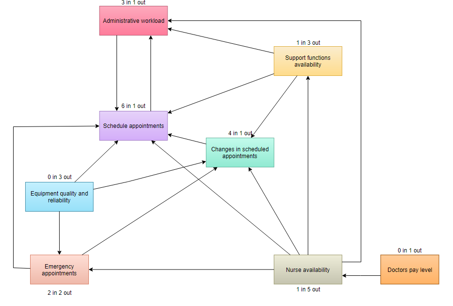
Interpreting the Diagram Result
A high number of outgoing arrows indicate that an issue is a driver or possible root cause. The team generally evaluates these issues first to gain the most far-reaching results. A high number of incoming arrows indicates that an issue is an outcome. These issues may serve as important measures of success.
- Count the arrows in and out for each idea. Write the counts at the bottom of each box. The ones with the most arrows are the key ideas.
- Note which ideas have primarily outgoing (from) arrows. These are basic causes or drivers.
- Note which ideas have primarily incoming (to) arrows. These are final effects that also may be critical to address.
- Be sure to check whether ideas with fewer arrows also are key ideas. The number of arrows is only an indicator, not an absolute rule. Draw bold lines around the key ideas.