I believe that you have had such an experience. When you encounter a problem and want to solve it, you always find that there are so many factors that affect the problem. It is so much that you don’t know which one to start with. In fact, most of the problems are the so-called 80/20 rule, that is, as long as we can get rid of 20% of the main factors, we can solve 80% of the problem, while Plato (Pareto Chart) is to help us find out the main cause that can affect the 80% of the problem.
“80% of the outputs result from 20% of the inputs.” – The Pareto Principle
The theory of the Pareto Chart is extremely simple, that is, always find only the first three major causes of great influence or 80% of the main causes. You can then concentrate on the resources, and prescribe a solution for these main causes, which can not only save resources but also achieve immediate results. On the contrary, it may be that the resources are not concentrated enough to achieve poor results or even cause waste (the cost of the improvement is greater than the original loss).
The Origin of Pareto Chart
Pareto Chart was originally designed by the Italian economist Pareto. It was originally used to represent the distribution of national income. Later, it was used as a quality control tool to analyze problems and sum up the impact of factors, so it was called Plato. This cause analysis tool is considered one of the seven basic quality tools, and as well as one of the 5 root cause analysis toolset.
Why Pareto Chart?
A Pareto Diagram has several key benefits…
- Pareto chart is easy to draw
- Pareto chart help your team focus on the inputs that will have the greatest impact
- The Pareto chart helps visualize problems quickly, so this is an excellent visual communication tool as well.
- Pareto chart also provides an easy way to compare before and after representation to verify that any process changes had the desired result
How to Draw Pareto Chart
A Pareto chart (also called Pareto diagram, or Pareto analysis) is a bar graph. The lengths of the bars represent frequency or cost (time or money) and are arranged with the longest bars on the left and the shortest to the right. In this way, the chart visually depicts which situations are more significant.
- Firstly, the phenomena, conditions or causes of the problem are categorized. When collecting data, we should define the scope of classification as clearly as possible, and even descriptively define the scope, to avoid errors in data collection.
- Decide on the period during which the data is collected. During the data collection period, it is necessary to collect enough quantity to represent the product process.
- The vertical axis (Y) on the left can be expressed in terms of quantity or amount
- The vertical axis (Y) on the right is expressed as a percentage from 0% to 100%.
- Arranged on the horizontal axis (X) from left to right, and from large to small according to the order of the total size of the classification.
- Draw a histogram and indicate the data.
- Draw a curve of the cumulative percentage.
Pareto Example – Glass Plate Forming
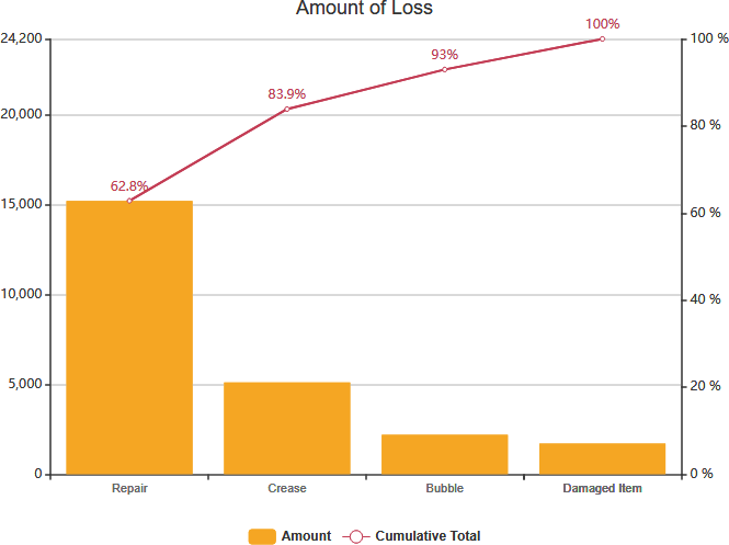
A glass factory wants to improve the process defects of the glass plate forming and makes a Pareto analysis review.
First, the last month’s bad losses and the various defect categories were expressed as a Pareto along the horizontal axis. The results show that the repair losses accounted for 62.8% of the total loss, and the amount converted into a monthly loss of $15,197.6 (= 24,200 × 62.8%), although the repaired products can also become good, the damage caused by such repairs is very big.
In the next month, the types of repairs were classified again, and data was collected to make Pareto analysis. It was found that the most repaired was the repair caused by Bending.
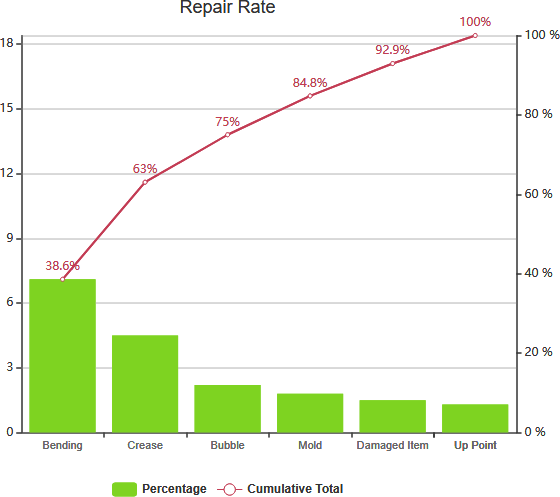
Through these two Pareto analyses, the factory should be able to know the direction of future process improvement. As long as some measures are taken to improvement actions, the defect rate can be reduced by more than half.