A bubble chart is a type of chart that displays three dimensions of data (the X-axis data, the Y-axis data, and data represented by the bubble size). Thus, it is often be considered as a variation of the scatter chart. People may consider a bubble chart instead of a scatter chart, if your data has three data series that containing a set of values. The sizes of the bubbles are represented by the values in the third data series.
For example, we can use a bubble chart for comparing and visualizing the relationships between projects or investment alternatives in various dimensions such as cost, value and risk. Bubble charts can facilitate the understanding of social, economic, medical, and other scientific relationships.
Why We Use Bubble Charts?
A bubble chart displays a set of numeric values as circles. It is especially useful for data sets with dozens of values that differ by several orders of magnitude. The color of the circles in a bubble chart represent different data values, with the size of a circle corresponding to the value. It is often be used for:
- Can show the relationship of one variable to another
- Unique ability to show data about a third dimension
- Can visually display correlation and trend
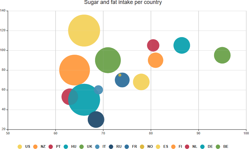
Bubble Chart Example – Sugar and Fat Intake Per Country
Chart showing basic use of bubble series with a custom tooltip formatter. The chart uses plot lines to show safe intake levels for sugar and fat. Bubble charts are great for comparing three dimensions of data.
Edit this Bubble Chart Template
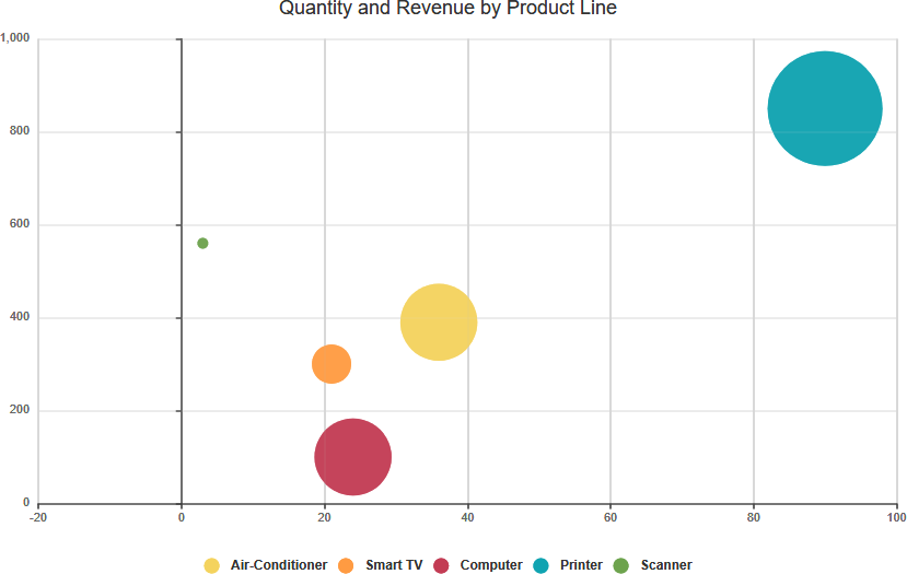
Bubble Chart Example – Quantity and revenue by product line
The following example plots quantity and revenue by product line. The size of the bubble represents the amount of gross profit.