A Radar Chart (also known as a Polar Graph, or Spider Chart) visualizes multivariate data which are used to plot one or more groups of values over multiple common variables represented on axes starting from the same point. Each axis represents a quantity for a different categorical value for the subject.
The Radar Chart a good tool for comparing many alternatives at a time against criteria. It is very useful for portfolio decisions where you may consider several alternatives and commit to implementing just a few of them based on their relative merits. The benefits of a radar chart include:
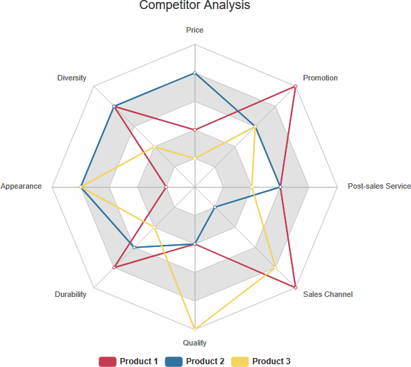
- It allows a visual comparison between several quantitative or qualitative aspects of a situation, i.e. Competitor Analysis for multiple products.
- It captures the different perceptions of all stakeholders of the organization related to relevant performance metrics, i.e. Customer Satisfaction.
- In gap analysis, the `desirable state’ and the `present state’ data can be plotted on the same chart to demonstrate graphically the gap between them, i.e. “as-is” and “to-be” analysis.
However, a limitation of a Radar Chart is that it tends to provide just a snapshot of the performance levels at any given time.
Six Steps for Creating a Radar Chart
The steps below outline the major steps to take in creating a radar chart.
- Assign an axis to a variable
- Each of these axes is arranged radially around a central point and spaced equally.
- The data from a single observation are plotted along each axis and connected to form a polygon.
- Additional observations can be placed in a single chart by displaying multiple polygons.
- Overlay them and adjust the opacity of each polygon for each of the observations
- Examine the differences or gaps among the variables for each of the observations.
Competitive Analysis Using Radar Chart
Competitive analysis is the process to identify and evaluate your competitors’ strengths and weaknesses relative to those of your product or service. The evaluation should give you a better understand of you and your competitors, which helps you position your company better to play up your strengths and weaknesses.
Now, suppose you were asked your customers to rank your product with two of your competitors on 8 aspects (Price, Advertisement, After-Sales Services, Quality, Product Durability, Appearance, and Diversity) and then show them graphically in form of a Radar Chart:
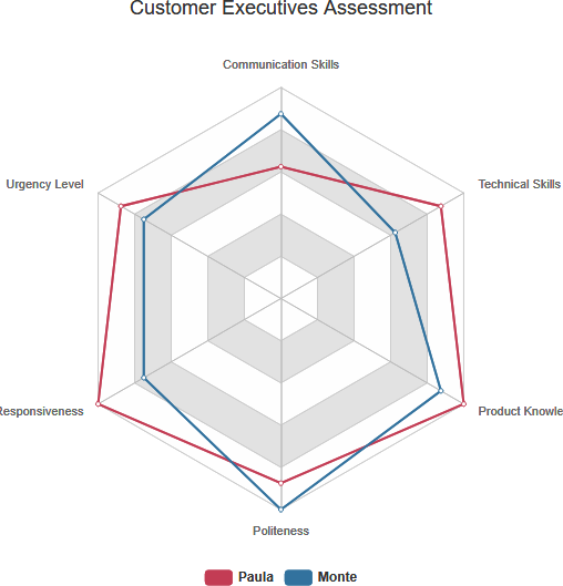
Spider Chart Example – Customer Rating of Customer Support Staff
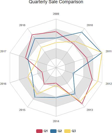
Spider Chart Example – Quarterly Sale Comparison