A scatter diagram (Also known as scatter plot, scatter graph, and correlation chart) is a tool for analyzing relationships between two variables for determining how closely the two variables are related. One variable is plotted on the horizontal axis and the other is plotted on the vertical axis. The pattern of their intersecting points can graphically show relationship patterns.
Most often a scatter diagram is used to prove or disprove cause-and-effect relationships. While the diagram shows relationships, it does not by itself prove that one variable causes the other. Thus, we can use a scatter diagram to examine theories about cause-and-effect relationships and to search for root causes of an identified problem.
For example, we can analyze the pattern of motorcycle accidents on a highway. You select the two variables: motorcycle speed and number of accidents, and draw the diagram. Once the diagram is completed, you notice that as the speed of vehicle increases, the number of accidents also goes up. This shows that there is a relationship between the speed of vehicles and accidents happening on the highway.
Scatter Diagram Correlation Patterns
The degree to which the variables are related to each other depends on how the points are scattered over the chart. The more the points plotted are scattered over the chart, the lesser is the degree of correlation between the variables. The more the points plotted are closer to the line, the higher is the degree of correlation. The degree of correlation is denoted by “r”.
The following types of scatter diagrams show in the table tell about the degree of correlation between variable X and variable Y.
| Correlation Pattern | X / Y Values |
| Strong Positive Correlation | The value of Y increases as the value of X increases. |
| Strong Negative Correlation | The value of Y decreases as the value of X increases. |
| Weak Positive Correlation | The value of Y increases slightly as the value of X increases. |
| Weak Negative Correlation | The value of Y decreases slightly as the value of X increases. |
| Complex Correlation | The value of Y seems to be related to the value of X, but the relationship is not easily determined. |
| No Correlation | There is no demonstrated connection between the two variables. |
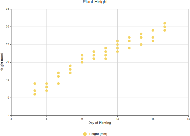
Strong Positive Correlation
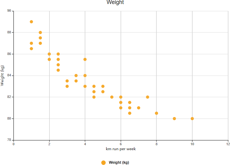
Strong Negative Correlation
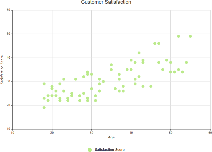
Weak Positive Correlation
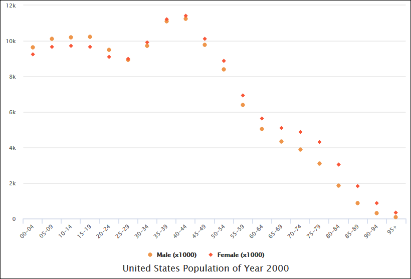
Complex Correlation
No Correlation
Scatter Chart Example: Arm Length on Grade 11
The scatter graph shows information about the height and the arm length of each of 8 students in Year 11. If we see the correlation between the student’s height and arm length exhibit a trend, we can estimate the arm length of a student with a certain value of height given and vice-versa. The chart above shows there is a positive correlation between arm length and height.
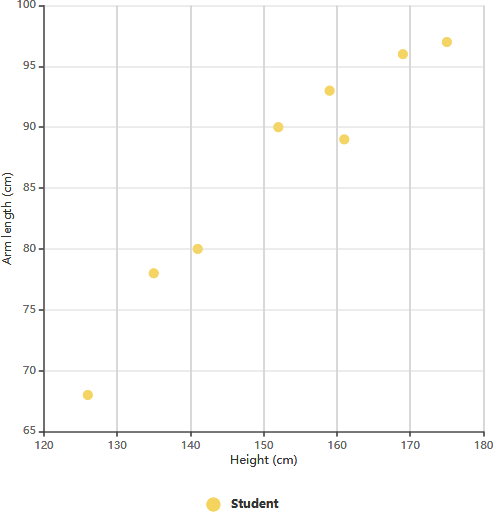
After determining the correlation between the variables, you can then predict the behavior of the dependent variable based on the measure of the independent variable. This chart is very useful when one variable is easy to measure and the other is not. For example, a student in Year 11 has a height of 148 cm, we can estimate the arm length of this student is around 84 cm.