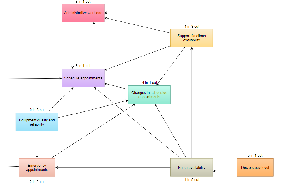
A small hospital was concerned about the productivity of its doctors because they were the most expensive employees and critical for the treatment of the patients. They decided to create an interrelationship diagram and include the following factors in the analysis:
- The number of scheduled appointments per doctor
- The number of emergency appointments per doctor
- Administrative workload per doctor
- The number of changes in scheduled appointments
- Equipment quality and reliability
- Nurse availability
- Availability of other support functions
- The doctors’ pay levels
(*source – asq.org – Root Cause Analysis Example)
When the interrelationship diagram had been completed, attention shifted from improving the doctors’ Scheduled appointment (the outcome: 6 in 1 out) to ensure the availability of nurses (The possible key cause: 1 in 5 out), other support functions, and operational equipment.