An Interrelationship Diagram is a visual display that maps out the cause and effect links among complex, multivariable problems or desired outcomes. With the linked connections, you can better analyze the cause-and-effect relationships that exist among all factors of a complex situation, which, ultimately, allowing you to develop an effective solution to the problem. You can logically link more than one factor at a time. Thus, this process encourages you to think in multiple directions instead of thinking linearly. Once all the relevant connections between items have been drawn, the connections are counted. Those with the most connections will usually be the most important factors to focus on.
Steps for Creating Interrelationship Diagram
To create an Interrelationship Diagram, it is important to write a statement that defines the issue of the problem going to be explored. Team members need to brainstorm ideas and write them around the main issues. Once the ideas are placed on the issue, connecting ideas using arrows to establish their relationship.
To create an Interrelationship Diagram:
- Identify the issue or question.
- Add issues / influences / Causes of the problem
- Compare each element to all others. Use an “influence” arrow to connect related elements.
- The arrows should be drawn from the element that influences the one influenced.
- If two elements influence each other, the arrow should be drawn to reflect the stronger influence.
- Count the arrows.
- The elements with the most outgoing arrows will be root causes or drivers.
- The ones with the most incoming arrows will be key outcomes or results.
Interrelationship Diagram Example – High Waiting Time for Buses
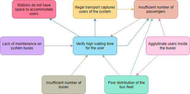
*Source: whatissixsigma.net
Analyze the Diagram
- Count the number of input and output (Input/output) arrows on each card and annotate it in one of its corners.
- If an element causes many others: These are the main causes.
- If an element is touched by many arrows: it represents the final effects.
- Those elements that concentrate a lot of incoming and outgoing arrows: They are key elements.
Interrelationship Diagram Example – Product Shipping Poor Communication
This example is taken from *Benbow and Kubiak in 2005). Now, let’s interpret the meaning of the diagram, so, what are the key factors or causes to investigate and improve?
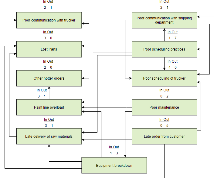
Recall that:
Identify the Key Cause (Driver)
We called the entries in the digraph concerns. A concern with a high number of output arrows is a driver or key cause. A key cause affects a large number of other items. The above diagram shows the following key causes:
- ‘Poor scheduling practices’ (6 outgoing arrows),
- ‘Late order from the customer’ (5 outgoing arrows), and
- ‘Equipment breakdown (3 outgoing arrows).
Identify the Key Concern
- A concern with a large number of input arrows is affected by a large number of other concerns. Thus, it could be a source of a quality or performance metric.
- ‘Poor scheduling of the trucker’ has 4 input arrows.
- A measure of poor scheduling performance of the trucker could indicate the magnitude of system problems causing late delivery.
*Benbow, D. W., and T. M. Kubiak – The Certified Six Sigma Black Belt Handbook. Milwaukee, Wisconsin, ASQ Quality Press in 2005.