The Pareto Analysis (known as Pareto Diagram or Chart) was designed by Vilfredo Pareto, an Italian engineer who made several important contributions to economic theory. The Pareto analysis helps a business to improve quality control, it highlights the most important factors in a data set. Thus, it helps to reduce project complexity by identifying the most important elements within a problem. Thus, it also helps management prioritize tasks and activities for business improvement initiatives.
The Pareto analysis is a visual chart that has vertical bars and a line graph. Being a combination of a bar and line chart, it is still very simple to draw, use, and communicate problems to stakeholders. The bars represent the individual values of the problem (in descending order), the line curve represents the cumulative sum, and the bars are segregated in descending order into categories from left to right.
Pareto Principle (80 / 20 Rules)
Pareto Principle (also known as the 80/20 rule) the idea that by doing 20% of the work you can generate 80% of the benefit of doing the entire job. Take quality improvement.
For example, a vast majority of problems (80%) are produced by a few key causes (20%). This technique is also called the vital few and the trivial many.
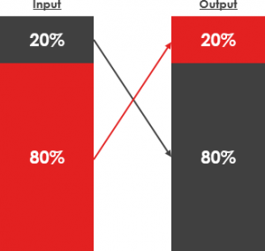
80% of the outputs result from 20% of the inputs. – The Pareto Principle
We can apply the 80/20 rule to almost anything:
- 80% of customer complaints arise from 20% of your products and services.
- 80% of delays in the schedule result from 20% of the possible causes of the delays.
- 20% of your products and services account for 80% of your profit.
- 20% of your sales force produces 80% of your company revenues.
- 20% of systems defects cause 80% of its problems.
The Benefits of Pareto Analysis?
Pareto Analysis helps visualize problems quickly, so this is an excellent visual communication tool as well. The following are a few benefits of Pareto analysis:
- Drawing a Pareto chart is easy.
- This diagram helps you segregate the problems and their causes.
- It helps you focus on solving the few causes which are generating the maximum amount of problems.
- It shows you the problems to focus on and get the most significant improvement.
Six Steps for Performing Pareto Analysis
Here are 6 steps to identifying the main causes you should focus on, using Pareto Analysis:
- Create a vertical bar chart with causes on the x-axis and count (number of occurrences) on the y-axis and arrange the bar chart in descending order of cause importance that is, the cause with the highest count first.
- Calculate the cumulative count for each cause in descending order and also calculate the cumulative count percentage for each cause in descending order. Percentage calculation: {Individual Cause Count} / {Total Causes Count}*100
- Create a second y-axis with percentages descending in increments of 10 from 100% to 0%.
- Plot the cumulative count percentage of each cause on the x-axis.
- Join the points to form a curve.
- Draw a line at 80% on the y-axis running parallel to the x-axis. Then drop the line at the point of intersection with the curve on the x-axis. This point on the x-axis separates the important causes on the left (vital few) from the less important causes on the right (trivial many).
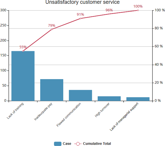
Pareto Analysis Example – Customer Services
Below is an example of a Pareto chart where causes of IT helpdesk unsatisfactory customer service performance are plotted. It is clear from the diagram that 79% of underperformance is caused by two factors: lack of training and inadequate pay. The former seems to account for 55% of underperformance and the latter for 24%. The other three factors account only for 21% of problems. Given the Pareto principle of 80/20, the most prudent course of action would be providing meaningful training to staff and revising a pay structure. Attacking these two factors will provide the greatest gains.
Pareto Chart Example – Hotel Services
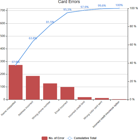
A credit card company was attempting to understand why a high percentage of credit cards were not being activated by its customers. The process improvement team chose to study 90 days of transactions. They found errors related to the cards that were not activated, as illustrated in the table below. Then, they determined the percentage of the total for each category and the cumulative percentage.
| Category | Instances | Percentage | Cumulative |
|---|---|---|---|
| Name misspelled | 272 | 37.88% | 37.88% |
| Address incorrect | 186 | 25.91% | 63.79% |
| Wrong phone number | 127 | 17.69% | 81.48% |
| Email incorrect | 99 | 13.79% | 95.26% |
| Incorrect credit limit | 19 | 2.65% | 97.91% |
| Wrong color card sent | 12 | 1.67% | 99.58% |
| Incorrect credit insurance option | 3 | 0.42% | 100.00% |
| Total | 718 | 100.00% |
The team grouped the smallest three categories that accounted for < 5% (incorrect credit limit, wrong color card, and incorrect credit insurance option) into an “other” category and created the chart below. After analyzing the Pareto chart, the group decided to focus their efforts on “name misspelled,” “address incorrect,” and “wrong phone number,” which accounted for roughly 80% of the total.
*Source: ASQ Pareto Chart Example